Most web traffic is now mobile, but we can forget that when considering how to make a pretty Facebook Page, leading to ugly header images that are cropped in weird ways — a terrible first impression to prospective new readers.
The tipping point with mobile was probably reached some time in late 2016 or early 2017, yet here we are in 2018, often still optimizing for desktop, when most of our customers are accessing our web pages and viewing our ads on mobile devices of some description — not just phones but tablets of all kinds too.
When I was redesigning this website, I was very conscious of that and made sure it was responsive and looked good for all screen sizes. And that requires more than just the screen resizing and things still being legible and images rendering correctly and buttons still working and navigation remaining intuitive. You also have to think about things like sign-up pages and sidebars too.
One thing that seems to get regularly forgotten about is your Facebook Page. We all understand the importance of having a pretty Facebook Page these days — particularly if you are investing in ever-more-expensive ads, it's crucial to have an enticing welcome on your Page itself, so you can catch as many "spillover" Likes as possible from your ad spend. Anything that helps with ROI these days is sorely welcome.
Unfortunately, it seems that lots of authors haven't checked what their Facebook Page looks like on mobile, which can lead to some cropping of that desktop-friendly image. There is contradictory advice out there on how to resolve it, which doesn't help, and lots of info that is out of date too as Facebook keeps changing the recommended dimensions in an ongoing effort to improve the mobile experience.
I combed through all the advice online and did a bit of testing myself, and put together not just one solution, but two, and you can choose whichever approach suits the image you would like to use—because most sites advise an approach which leads to side-cropped images, when sometimes only a top crop will do.
By the way, the below was sent to my mailing list over the summer, and those lucky ducks have been swanning around with mobile-optimized Facebook Cover Photos for five whole months now, snaffling readers from under your inexpertly cropped noses. If you want to join that crew and get the drop on the latest marketing advice every Friday gratis then sign up here. You get a free copy of Amazon Decoded too!
For those of you who are already on my soon-to-be-universally-acclaimed mailing list and feast each Friday on these multifarious marketing morsels, I won't leave you high-and-dry. You can check out this guest post I did over at the BookBub Partners Blog today — Book Marketing Mistakes You Need To Stop Making. The rest of you can read that in a few minutes. First, scroll down and we'll give your Facebook Page a quick makeover.

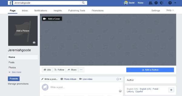
The reason we are starting here is because an enticing Facebook Page will collect Likes for us passively in the background — and these "organic" Likes are some of the best quality Likes you can get, costing nothing too. Also, having a tricked-out Facebook Page will also increase the "free" spillover Likes we get from any advertising, helping with that ever-slippier ROI. Facebook helpfully encourages users to Like advertiser pages in various ways, but you aren't going to get many spillover Likes if your page looks like this one by my lazy friend, who was in no way invented for this spurious exercise.

Jeremiah No Goode if you ask me! *awkward laughter* Read more of this post


No comments:
Post a Comment
Note: Only a member of this blog may post a comment.